


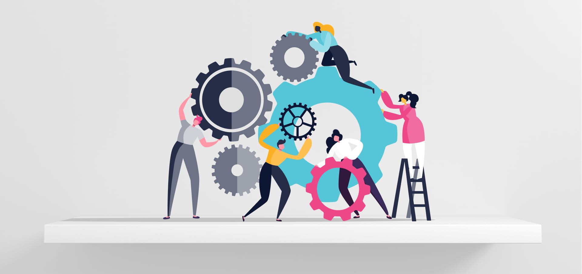
s we enter a new decade of inclusion, multiculturalism and activism, it is more important, and easier, than ever to create accessible learning products for the abilities and needs of all learners.
One in five Australians experience disability (yes, that’s two people on a 10-person soccer team) (Australian Bureau of Statistics, 2019) and for 3% of Australians, this is an intellectual disability (Australian Institute of Health and Welfare, 2008). This means that it can be hard to process language, socialise and complete daily tasks (Disabled World, 2016).
Free Checklist: Everything you need to know to make your content accessible
So when we design a product, we need to create an experience which is based on what our learners can do, rather than what they cannot. By doing this, not only do we work towards levelling the playing field, but we improve the learning experience for everyone.
Here are four ways you can address the needs of people with intellectual disabilities in your product:
#1 Establish the learner’s journey and progress:
Imagine this: you’re driving to your friend’s new house in an unfamiliar area. You don’t know the way, so you’re using your phone’s GPS to get there. A message pops up on your phone, ‘Battery level low. Please connect to a charger.’ Oh no. With 5 minutes to go, your phone dies, leaving you stranded with no way to find your friend’s house. How do you feel?
When we create a learning product, we need to explicitly outline our user’s path, or our learners will become lost before they can say ‘does anyone have a USB C cable?’ All relevant information needs to be presented clearly and logically in a way that helps the learner understand where they are up to and where they are headed. Avoid including irrelevant information, instead, create a ‘map’ of progression through the product.
To guide our learner’s journey:
- Create clear lists of what information will be needed and when it’ll be needed
- Establish patterns to anchor users, such as using symbols for repeated information
- Implement progress markers so that the user is clear about what has been completed and what is yet to come
Try not to:
- Change the appearance of interfaces when similar information is being covered
- Require the user to switch between pages and screens unless it is essential
- Require users to store too much information in their minds
#2 Clarify the main message with language and visuals
Read this sentence: "I ruminate on and fulfil organisational and aesthetic actions to installed display devices in order to facilitate the exchange of product entities for economic resources."
What on earth does that mean? If it was covered up, would you be able to recall what it says? How could we make this sentence easier to understand?
Well, this sentence could have been written like this: "I organise shelf displays and make them more attractive so that customers will buy products." Not so confusing now, right?
While the meaning was simple, the complicated wording of the first sentence probably made you feel confused about what it was trying to say. In accessible products, the language helps to clarify the main message rather than losing it in the middle of a word salad. To do this, we can use clear and simple language that gets straight to the point. We can also support our main message with audio-visual aids.
To clarify our main message and simplify learning:
- Use repetitive and well-establish icons as image supports. However, remember that images are a language too and might be hard to process!
- Use simple layouts
- Order content in a clear and logical way
Try not to:
- Use confusing language or jargon
- Use colour or animation for text

#3 Let go of the reliance on numbers
Time for a maths break! Before you protest, I promise it’s not that hard! There’s one catch though, you need to do the problem in your mind- no paper allowed.
“A graphic design and packaging company, Papier, is hired to package 600 Wonka craft chocolate bars. Wonka will pay $200 for the design costs and an additional $0.20 for the packaging of each bar. For each broken bar, Papier will deduct $2.00 from the total cost. If 37 chocolate bars were broken, how much would Wonka pay Papier?”
See! I told you it wasn’t that hard… if you were writing it down that is. Even though the maths in this problem is simple, it would be pretty hard to answer without recording some details.
Our brains are like computers, they are very powerful but have limited processing power. The more processing power that is used, the higher the cognitive load. Remembering and interacting with numbers and facts has a high cognitive load. When the cognitive load is too high, a person cannot complete a task.
Numbers and data can present a processing minefield for people with intellectual disabilities, so we should always try to reduce the cognitive load.
To reduce the cognitive load:
- Use icons or text input options
- Use slider scales without numbers input options
- Use simple selection options for numerical inputs when numerical input is essential
Try not to:
- Make references using numbers
- Require the user to recall data between screens
#4 Minimise multitasking!
In 2020, we’re all pretty used to multitasking. And as we’ve become accustomed to multitasking, we’ve all had our fair share of multitasking “incidents”. Whether that’s checking Facebook and burning the dinner, or sending a picture of your Friday night antics to your boss. Stop blushing- we’ve all done it! When we multitask, our attention is split across various tasks, meaning that we find it hard to focus on what’s important.
Accessible products ensure that multitasking is kept to a minimum. This means removing extra information and distractions to allow our learners to focus on engaging with the product.
To minimise multitasking:
- Provide simple navigation paths
- Consider the language that is being used and whether it will be read or heard
- Offer a “pause” or “save progress” option if context switches are needed
Try not to:
- Require users to listen and read at the same time
- Require the user to switch contexts repeatedly
- Require the user to switch screens or paths to access related information
Final thoughts
Over the years, designing for accessibility has been met with dismissive hand-waves and hushed comments about “box ticking” and being “too hard”. But by designing for all abilities, we improve the learner experience for everyone. In this new decade, it’s time that we acknowledge that accessible learning is better learning for all.
HowToo
If you’re looking to design accessible eLearning courses, How Too authoring tool is a must-use for you. HowToo recognises that accessible learning is better learning for all. With built-in accessibility to a WCAG 2.1 AA standard, you can rest assured that your content meets the needs of all your learners.
More from
Accessibility
category


